Best Ombre Nail Color Combinations for Every Season
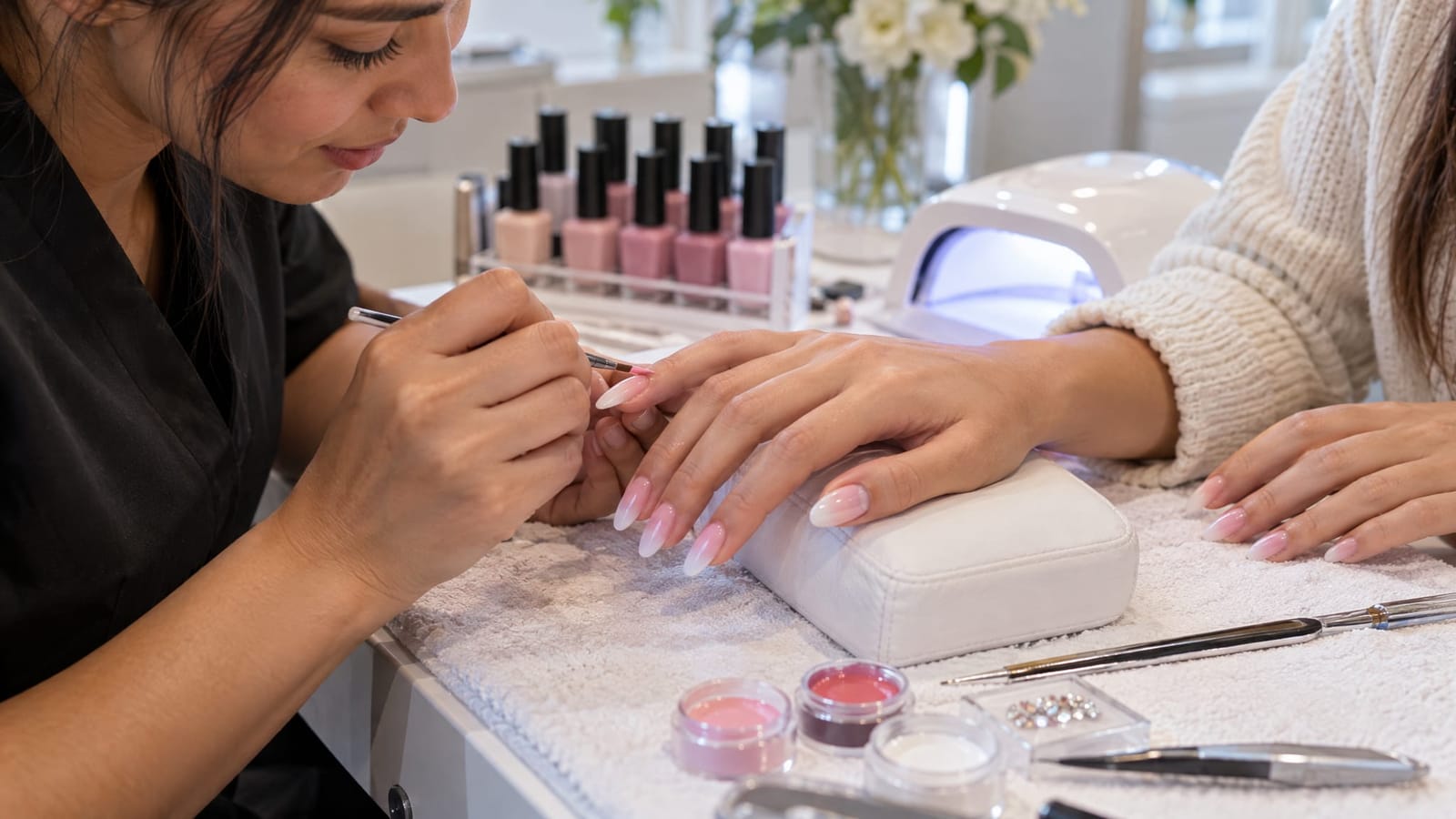
For a soft, versatile manicure, pink fading into milky white is a strong starting point. Lilac and cream offer a pastel alternative, while beige and burgundy create a more noticeable contrast. The best ombre nail colors are the ones that give you the right balance of subtlety, color and definition.
Ombre blends shades gradually rather than separating them with a sharp line. Color placement matters just as much as the pairing: a dark tip feels different from a dark base, even when the shades stay the same. These ten combinations move from spring pastels through summer brights, autumn neutrals and winter shimmer, with ways to adapt each look to your skin tone and preferred length.
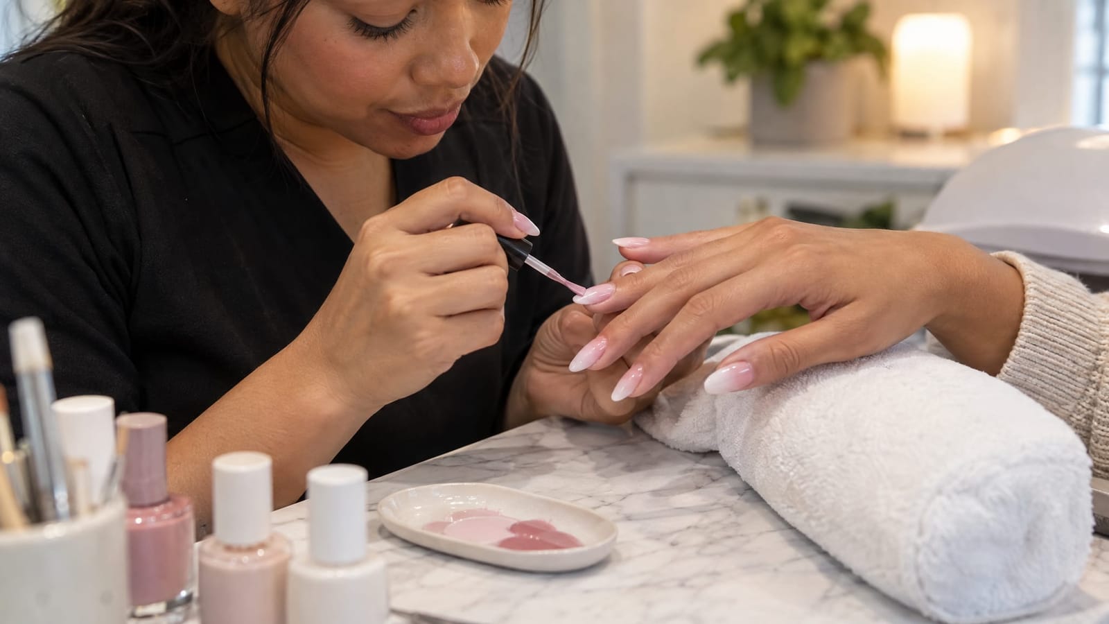
1. Rosy Pink to Milky White: A Soft Spring Look That Works Year-Round
Pink and white ombre offers the soft contrast of a French manicure without a defined white tip. Choose translucent rosy pink at the base and let it fade into milky white toward the edge. A brighter, more opaque white creates a more noticeable finish.
The base pink is the important choice here. Peach-pink brings warmth, rose gives a cooler impression, and a deeper rosy nude can make the transition feel more connected to deeper skin tones.
For short nails, keep the white concentrated near the tip rather than letting it cover most of the nail. That leaves room for the pink and the blend without requiring extra length.
2. Lilac to Cream: A Gentle Pastel Pairing for Spring
Lilac and cream create a low-contrast gradient with more color than a traditional neutral manicure. Keeping both shades similarly pale gives the blend a soft, continuous appearance. A stronger violet base with a cream tip makes the same idea more defined.
Cream brings a little warmth to cool lilac. For a cooler overall palette, replace it with milky white. Keep extra decoration minimal if you want the pastel transition to remain the focus.
This pairing also translates well to a shorter shape. Our ombre nail ideas for teens explores more understated gradient choices for readers who prefer a less dramatic set.
3. Mint to Sage: A Muted Green Gradient for Spring
Mint and sage offer color without the intensity of neon green. The easiest way to keep this pairing cohesive is to choose shades with a similar undertone. A blue-leaning mint works naturally with a cooler sage, while a yellow-leaning mint suits an olive-tinted sage.
Use pale mint near the base and sage toward the tip for a darker outer edge. Reverse the placement if you prefer a lighter tip.
For a restrained result, choose a small difference in depth between the two greens. A very pale mint and a much darker sage will make the fade more prominent, even though both colors are muted.
4. Peach to Coral: A Warm Summer Blend
Peach and coral sit close enough in color to create a gradual transition while still giving you a lively summer palette. A sheer peach base with coral concentrated at the tip offers a softer version. More opaque peach and vivid coral create a bolder set.
For a pinker result, choose rose-coral. For more warmth, move toward orange-coral. That distinction is often more useful than simply requesting “coral,” which can describe quite different shades.
If you want color without a fully bright manicure, keep most of the nail peach and reserve the coral for a narrow section near the edge.
5. Sky Blue to Pink: A Playful Two-Color Summer Gradient
Sky blue and pink give an ombre manicure two distinct color families. Choose shades with similar brightness so one does not overwhelm the other. Pale blue and blush feel soft; brighter blue and saturated pink create a more graphic look.
The blended middle may read as lavender, so leave room for that transition rather than expecting only two separate colors. On shorter nails, a simpler, softer fade can keep the design from looking crowded.
If embellishments appeal to you, place them on a limited number of nails. That gives the blue-to-pink blend space to remain visible instead of competing with several decorative details.
6. Rosy Beige to Burgundy: Neutral Meets Bold for Autumn
A rosy beige base fading into burgundy is a useful compromise between a neutral manicure and a dark set. The lighter base keeps part of the nail understated, while the burgundy tip adds depth.
Look for a beige with a pink or mauve note if you want a closer relationship with the wine-colored tip. A warmer tan base creates a more contrasting combination.
Placement controls the mood. A small burgundy section reads as an accent; extending burgundy farther toward the base makes the whole manicure feel darker. This is a good pairing when you like rich color but do not want every nail fully covered in it.
7. Caramel to Chocolate: A Warm Neutral Pairing for Autumn
Caramel and chocolate create an ombre that feels coordinated without relying on pale pink or beige. Choose golden caramel for a warmer blend, or a more muted brown base for a less golden result.
Compare both endpoints against your hand. If caramel is close to your skin tone, chocolate supplies the definition. If chocolate is closer, a lighter caramel creates the contrast instead.
For a dressier variation, a small amount of gold shimmer can complement the brown palette. Keep the distinction clear in your inspiration: a brown color fade with gold accents is a different design from a gold-glitter fade over a solid brown base.
8. Deep Plum to Lavender: A Dark-to-Light Look for Late Autumn
Plum and lavender share a purple foundation but offer a clear difference in depth. Deep plum at the base fading toward a lavender tip creates a dark-to-light gradient. Reversing it puts the visual weight at the tip.
For a cohesive blend, choose either two red-leaning purples or two blue-leaning purples. Mixing those directions can create a more complex middle shade, which may not resemble a saved photo.
Longer nails provide more visible space for a gradual transition. On shorter nails, moving from medium purple to lavender rather than near-black plum to lavender can make the fade feel less compressed.
9. Charcoal to Soft Grey: A Cool Winter Alternative to Solid Black
Charcoal and grey deliver a dark manicure without making every part of the nail equally deep. Charcoal at the tip gives a defined edge, while a darker base fading into pale grey creates a lighter outer finish.
Choose blue-grey for an intentionally cool palette or taupe-grey for a warmer version. Keeping the undertones consistent helps the two shades look connected.
The finish changes the design, too. Gloss adds reflections, while matte gives the colors a more muted appearance. When selecting an inspiration image, separate what you like about the grey pairing from what you like about its finish.
10. Icy Blue to Silver Holographic: A Light-Catching Winter Look
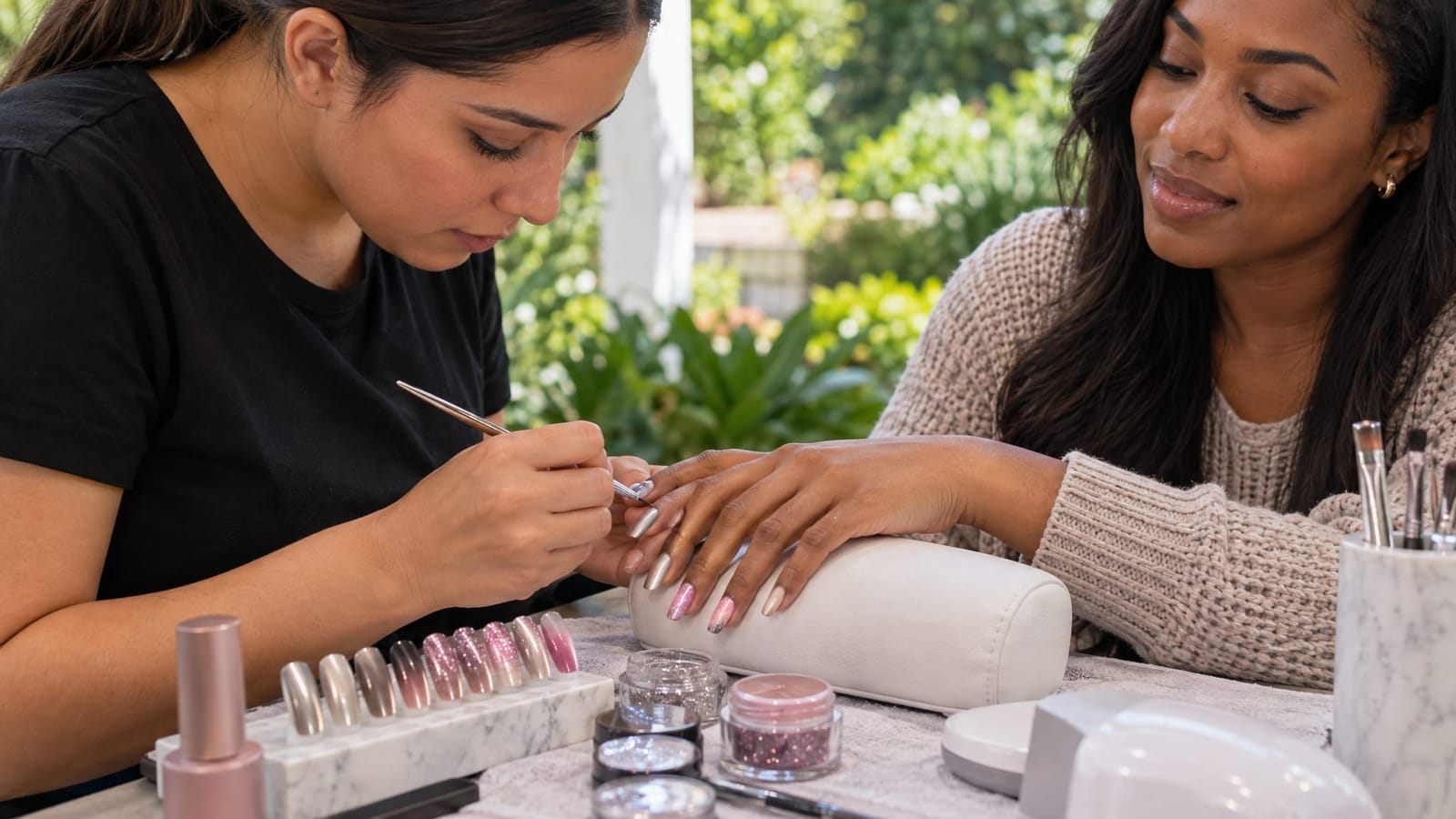
Icy blue paired with silver holographic detail adds shifting color to a cool winter palette. Holographic finishes reflect rainbow colors as the light changes. Plain silver shimmer is not the same effect.
This design can be a blue-to-silver color transition, or it can use a pale blue base with holographic sparkle becoming denser toward the tips. Those are different approaches, so identify which one your reference shows.
Our comparison of chrome ombre nails vs glitter ombre explains the distinction between a reflective finish and visible sparkle. That difference matters when choosing a finish, not just a color name.
Choose Undertones and Contrast, Not Skin-Tone Rules
Any skin tone can wear pastels, dark shades or bright gradients. Use undertone as a starting point rather than a restriction: peach, caramel and golden shades offer warmth, while lilac, blue-pink and silver give a cooler impression.
The more useful question is how much contrast you want against your hand:
- For a subtle look: choose a base close to your skin tone and a second shade only a little lighter or darker.
- For a defined gradient: make sure the two endpoints differ visibly in depth, not just in color name.
- For a bold look: choose a light endpoint, a dark endpoint or a saturated color that stands apart from your skin tone.
Compare shades beside your hand when possible. Names such as “nude,” “blush” and “beige” cover a wide range of colors and do not describe how a shade will look on everyone.
How to Translate Inspiration Into Your Salon Design
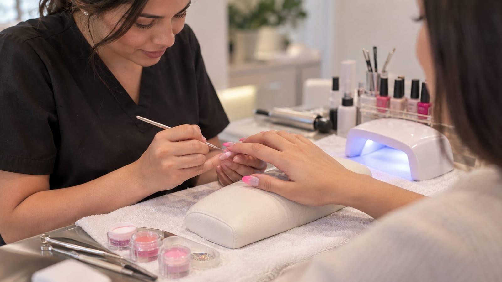
At NailzByDelz Corp in Spokane Valley, we offer ombre nails and custom nail art, along with gel manicures and acrylic nails. Ombre describes the color effect, not the material used to create the nail, so choosing a palette is separate from deciding on length and structure.
A useful inspiration reference includes more than a favorite photograph. Note the details that matter most:
- The two endpoint colors: for example, rosy beige and burgundy rather than simply “neutral and red.”
- The fade direction: which color sits at the base and which reaches the tip.
- The balance: mostly light with a small dark tip, or an evenly shared gradient.
- The finish: glossy, matte, metallic or visibly sparkly.
- Your preferred length: especially when the reference shows much longer nails.
A photo communicates a design direction, but lighting, filters and screen settings can change how its colors appear. Nail length also affects the space available for blending. The most practical goal is to match the defining features of the look rather than every detail of a screen image.
Start with the pairing you like, then decide how much contrast and sparkle you want. Seasonal colors are inspiration, not limits. A soft winter pastel or a deep summer gradient can feel just as considered when the colors, placement and finish work together.